Date: Sep 2024
Industry: Food & Beverage
Role: Brand Strategy, Packaging Design, Visual System, Logo Design, Photography, Art Direction, Prints
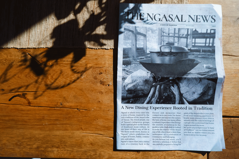
Ngasal is a family-style Asian fusion restaurant in Los Angeles, inspired by Taiwanese culture and the Atayal tribe’s heritage.
Challenge & Limitation
The challenge is to design a modern food brand that celebrates indigenous roots, evokes a sense of home, and feels relevant to urban Asian Americans.
Solution
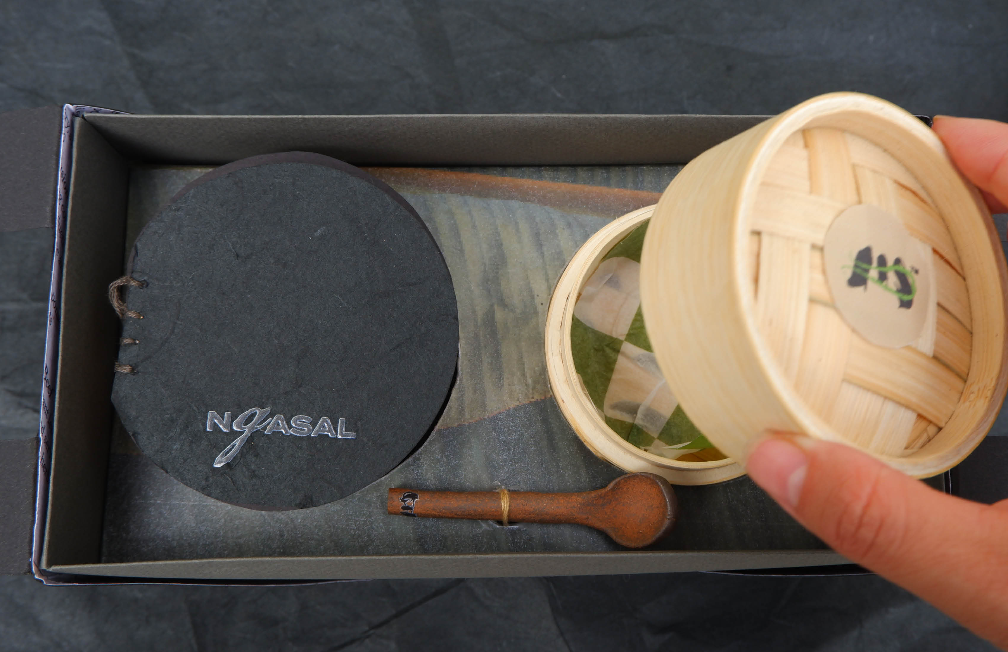
Ngasal’s identity draws from the symbolism of a three-stone fire—representing origin, family, and warmth. The logo, inspired by Chinese brush strokes, sits atop tactile surfaces and natural textures. Packaging is modular and transforms into a makeshift table. Every detail—down to newspaper lining and bamboo—reinforces the idea of “bringing home to the table.”